top of page
Logo, Menu, Interiors, & Graphics were re-designed to take this business from the 60's to present day. We kept the influence of the mid-mod design when Paragon was first created, but updated it with cleaner colors, fonts, and shapes. See the interiors page for Paragon's interior design.


Paragon Bowl Rebrand
Project by muin


I created this logo for a veteran multi-family community for an interior design competition while attending NDSU. The "wave" at the bottom is modeled after the alpha helix structure of wool. Wool is one of the most resilient fibers. It's able to be bent and twisted more than 30,000 times without breaking. This represents the resiliency and strength of the veterans.
Visit the interiors page to learn more about the interior.


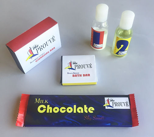
Jean Prouve Hotel
Germany meets France.
Inspired by the self-taught designer and architect, Jean Prouve, I decided to base my final project on him. We were to create a hotel brand with its own product line. We were given different products to design the packaging for: body soap, hand soap, shampoo, conditioner, and chocolate. The logo is a deconstructed version of his fauteuil de salon chair, and the color palette is inspired by the Bauhaus movement that was taking over at the time. The typography is a mix of his French heritage and German style mid-mod.


Product Packaging project for a graphic design class. Objectives were to create our own brand and design the paper wrap for a water bottle. I drew the polar bear and ice by hand and used Illustrator to turn the design into vector art. InDesign was used for the layout, and Photoshop was used to manipulate the colors to fit the Berilli brand. This project was meant to prepare me for my final project: the Prouve Hotel seen above.

I created the Palm Beach Villas logo for a project while studying graphic design at UND in Grand Forks. We needed to create a word logo design for a vacation resort. I chose the word beach and created a wave out of the letter "c."


bottom of page